Your Website - A Professional Look
Your website should instill confidence and credibility to the end user. It doesn’t need to be all flashy and contain moving gizmos and the like…just reflect your professional business.
 One way to do this is to maintain consistency in fonts, colors, and the like. Try to standardize fonts and typestyles that appear throughout your site…and in fact, should you have printed marketing materials, they should tie in as well.
Use only a select, few fonts. And remember, when on the internet, you never know what fonts are installed on the end user’s computer. As a result, most designers use the default windows fonts of Times New Roman, Verdana and Arial. Usually if there is a special font for headers or the like that a client wants to use, I will create a graphic of each header in the desired font and then embed them into the pages. That way they will always show as intended.
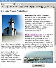
On a GraphicalData site, most pages that are generated with default settings use a set of defined fonts. If you are going to build your own pages, then I would recommend matching what your other pages reflect. Match the page headers with the Arial font at a 14 point size. Then change the color of the header to #333333 which is a soft black [for this use the “T” tool with the little color swatch in your tool html editor tool bar]. It sort of removes the harshness of large letters in all black. The rest of the page can be in either Arial or Verdana…your call.
Occasionally we may design headers with an underline and/or in different colors than mentioned above. If that is the case, you have it in your power to continue using the same protocol or change all to what you might like.
Some folks take a more liberal translation of what things should look like on the web, but a good point of reference should always be “what would this look like if it were in print?”. You can never go wrong with time proven techniques.


